Beautiful Full-Screen Dashboards!
Though Parse.ly’s focus has long been on unearthing insights from your content analytics data, we learned from customers over the years that one of the best ways to encourage staff to get excited about data is to make it widely accessible in full-screen dashboards. A couple of years ago, we released Glimpse, a full-screen dashboard optimized for large TV screens, and it instantly became a hit with customers.
Our new Parse.ly release this year took this concept even further. We now have a much richer, and more customizable, full-screen site overview. Even better, other listing screens can now be converted into full-screen dashboards, focused on different sub-sets of the dashboard data. We also allow you to control the metrics and filters that are shown in these dashboards. This post will showcase how all of this works.
The Big Picture with the Site Overview
One of the best parts of our new “Overview” screen is that it summarizes how you’re doing today vs your historical average. For example, this publisher is having “A Fine Morning”.
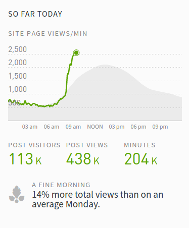
Checking in on this stat is certainly a nice thing, but what about sharing a full-screen dashboard with your whole team — by putting it up on a TV screen in your office or on a big 2nd monitor?
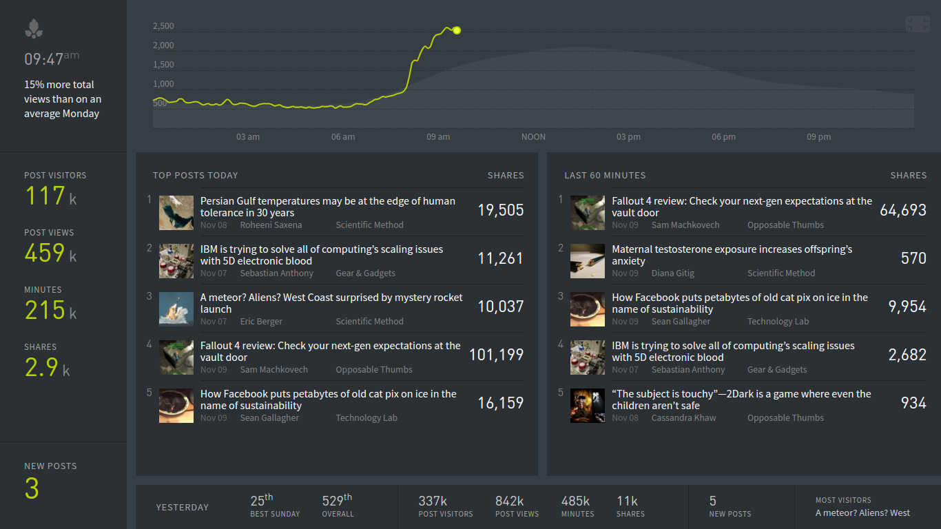
Staying on Top with Top Posts
In Parse.ly’s “Posts” screen, you can see all the top posts on your site by any metric and any time range in the last 24 hours.
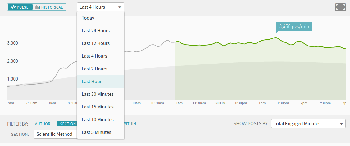
You can click the full-screen button in the top-right corner and create a full-screen version of this dashboard, which looks like this:
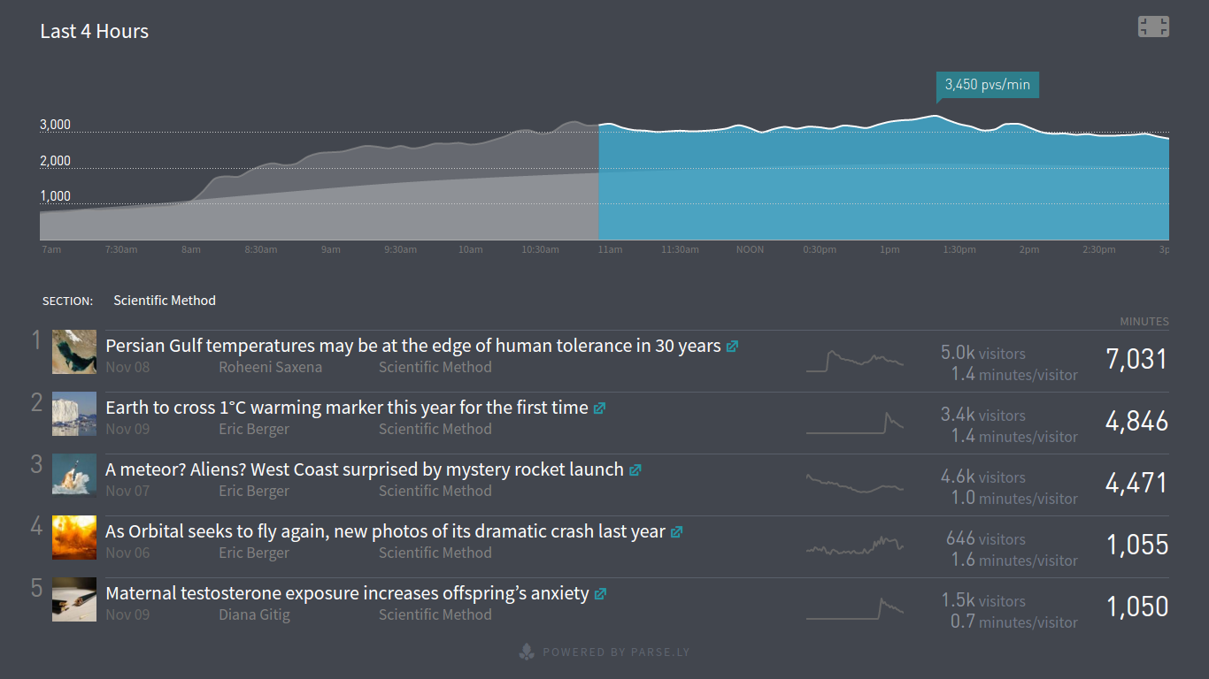
As you can see, the color scheme changes, the dashboard goes full-screen, but it preserves your time range, metric, and filter selections.
Friendly Competition with Leaderboards
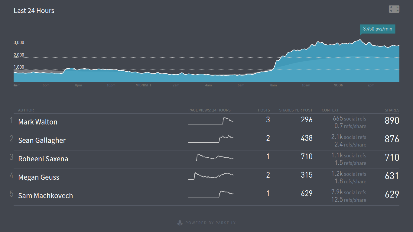
Have a bunch of colleagues on your team, and want to create some friendly competition around whose stories are getting most widely shared on social networks? In 2 or 3 clicks, you can do so with Parse.ly’s customizable full-screen dashboards for our author/section/tag data.
Here’s an author leaderboard sorted by social shares in the last 24 hours, also showing posts published and shares per post. Try it on your account here.
Remember Where You Were with Permalinks
One other long-requested feature was that the full-screen dashboards should be bookmark-able. In particular, this was useful to set it as the default “start page” of a Chromebox or dedicated media PC that might be projecting the Parse.ly dashboard in a given customer’s office. Well, this request is now satisfied!
Here’s an example full screen dashboard URL for top posts today:
Notice the fs=1 parameter — this is what tells Parse.ly to go into full-screen mode. So, you can save this in your bookmark toolbar, or make it a browser homepage.
Looking For Your Feedback!
We think we’ve improved full-screen dashboards dramatically in the new release, and have heard great feedback already. It will only get better over time. But, we want to hear from you more! Let us know if there are things you’d love to see or adjustments you’d hope we might make by getting in touch with your account manager today.
About The Changelog
The Changelog posts document changes to the Parse.ly dashboard through the eyes of co-founder and CTO, Andrew Montalenti. Interested in trying out the changes for yourself? Login to your Parse.ly account, or sign up to get started with Parse.ly today.