Making the Dashboard: UI/UX Decisions for Turning Audience Data into Insights
Ed Note: Last week, Parse.ly announced our latest product release, which included the rollout of a brand new dashboard. For those who like to know what goes on “behind the scenes” at a software company, we asked one of our UI/UX engineers, Toms Baugis, to talk about the decision making process. Besides being an prolific Python programmer, Toms also writes. Check out his work: http://milkisprotein.tumblr.com/
It has been a little over a year since we first started talking about how to make room for all the new data that our backend team had started working on—where to find place for GEL (Growth Engagement Loyalty) metrics and where the mobile/tablet/desktop split would fit and so on, and we knew that it would only be the beginning.
As it stood, our analytics panel was solid and functional and did it’s job, but there was no more room for growth. The years of active development and the countless lessons acquired over time had etched hundreds of lines in the palms of the product, and its beautiful face was aging—it was time for a fresh take.
What works and what doesn’t? Where is technology now (and it moves oh so quickly)? How to rebuild the product, now that we have seen such a great deal of the landscape?
The thought was simple—if we are going for a revamp—and it did feel like standing on the edge of a mountain, ready to jump, with a parachute strapped to your back—then it should be a swift move, that packs as much change as it possibly can, to reduce the load on the users.
Speaking from personal experience, relearning systems can be a hassle, and we wanted to get out of your way as quickly as we could, in return delivering a slew of improvements. So what did we decide on?
Good-bye Pulse, hello real-time all the things
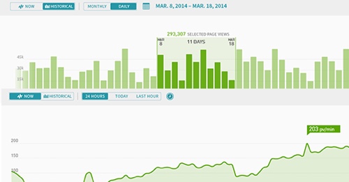
Well, everything has always been real-time or close to real-time. Pulse got refreshed every 5 seconds, while the historical screens got an update every five minutes. But there was a divide between Pulse and the rest of the system. With the refresh, and largely thanks to the new backend (which you can read about in this post from our CTO), we are now providing real-time screens for all aspects. Choosing whether you want to see just the last 24 hours (or even five minutes) or would like to see long term trends, now is a matter of a single toggle. We hope this will simplify your experience.

Glimpse is dead, long live full-screen
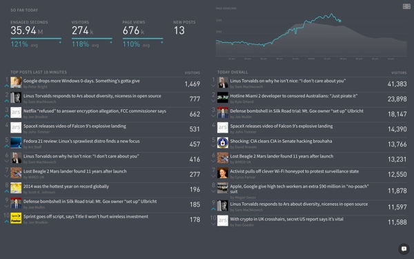
Glimpse was our first go at a full screen visualisation that would show your stats with pride and create excitement around the data—what’s hot and what’s coming, how is the site doing, and so on. It was exciting to create and it was even more exciting to see photos of Glimpse on big screens in newsrooms. But there was no good way to offer flexibility. On top of that, Glimpse was providing insights nowhere else to be found – the quick summary of how your site did yesterday, for example.
We wanted to give both: access to to this information outside of the big screen, and offer some configurability. The new Overview screen replaces Glimpse, and all listings are now equipped with a full-screen toggle as well! Listings allow you to filter down and pick a specific metric and timespan before going into the fullscreen mode.

So much more data
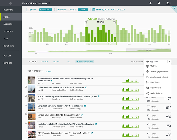
Unique visitors and time engaged are two rather peculiar dimensions of the data that we are now bringing into the interface. And the mix of the two—average time per visitor—is a true conversation starter that we hope will provide with a much clearer idea around interest. In addition, we have also started segregating data by whether it’s mobile, tablet or desktop.
The new dimensions are literally begging questions to be asked. Slicing, dicing and combining: the challenge now lies in finding how to tell the million stories each dimensions is able to provide, without overwhelming users with data. The balance between power, flexibility and focus, is a true war of tug. The focal question we ask ourselves is how to tell all the stories without “killing” with data. The preview already contains some of the answers – you will spot factoids that summarize the important figures (previously more prominent in Glimpse) and listings now feature context columns. But our work here is obviously far from done, and the future will only bring more delicious data.

The future is bright
The refreshed version is now in an “early preview” stage. We have reached certain level of solidity, but the refreshed version is still in active development. Things will change, kinks will be ironed out, features will crop up like mushrooms after rain, and bugs will be dealt with.
We hope you will like what you see, and we would love to hear from you! Don’t be shy to give a shout, using the feedback link in the interface. Anything goes!
See more about the release of the new dashboard here: www.parsely.com/parsely-2015