Making the Dashboard: Creating an Overlay for News Homepages
Editor’s Note: This week, we announced a new feature: Parse.ly analytics available directly on-site through an overlay. For those who like to know what goes on “behind the scenes,” we asked our tech lead and UI/UX developer, Toms Baugis, to talk about what he learned while working on this project. Toms has worked on the dashboard since the very beginning and keeps a blog of personal musings at strikerverse.tumblr.com.
Two conditions have to be met for a piece of content — written or otherwise — to be successful. The first one is the content itself: is it any good (where “good” could mean oh so many things)? The second one is exposure (or one could say – “Location, location, location!”). For it won’t matter how brilliant the content is if nobody knows about it. The first is pure mastery, but from the technical perspective it is possible to at least try tackling the second.
One of the prominent tools at publisher’s disposal is its frontpage that many readers frequent more than just a few times a day. While any article posted on the frontpage will get a boost, how do you quickly know if something has struck a chord in the readership? Parse.ly’s new overlay tries to address that, and with it now available I thought I would share few insights that came from working on it.

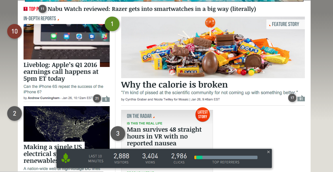
The overlay adds badges to the homepage, with the number in the badge indicating its rank in the last ten minutes, with one being the most popular post on the page right now. Hovering over the badge will reveal detailed information.

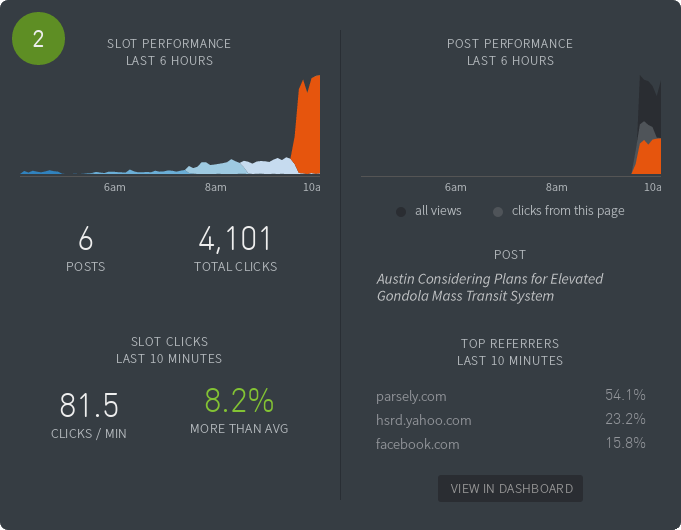
If you look at the left side, the timeline there shows posts over time cycling through the specific spot on the page and the number of clicks they generated. It looks like the last one, published about an hour before, has really resonated with the public, well beyond the norm. The right side tells about this post in detail and lets you jump to dashboard for further investigation as well.
That was the end result, but to get there, I had to observe front pages for days. Here’s a few notes I made:
1. Location Isn’t Everything
Figuring out what readers do and do not like reading about, and how deep they will scroll before giving up, is a game that at time defies logic and even the most educated guesses. We found that at times, and more often than not, readers are blatantly jumping over the prime spot that occupies half of the first screen, only to click on something that is whole two pages down – to the point where it becomes the top-clicked post on the page.
2. No Story is an Island
Imagine a reader coming to your site after the lunch break. They have five minutes to scour the news. Like a hunter tracking down its prey, the reader scrolls through the page. His time is limited, so he won’t read it all. Which item will he click on? It depends on what else is out there.
From observing the prime locations on the frontpages, we saw how one breaking news article would affect the whole page. Posts that were previously in the center of the attention would suddenly lose the momentum while all eyes turn to the newcomer. Something to keep in mind to avoid two breaking stories competing with each other.
3. If You Build It, Will They Come?
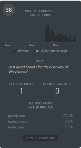
Imitating their paper siblings, online news sites at times tend to have lots of content on the frontpage. As there are just so many links one can click in a session, it was predictable to find that there are portions of page that receive less attention from the readers, but the surprising part was how much less exactly: we found that some sections receive almost no attention.

Like in the screenshot above – sometimes it can go to as low as a single click in six hours.
Your Story
But, really, every site, every frontpage has its own story to tell, and our collective intent at Parse.ly is to hand you the data in a manner that you can act upon. Give it a spin, and let us know what you think!