Here’s Why Creative Types Might Be Better at Data Interpretation Than Analysts

Parse.ly is headquartered in New York City, which boasts one of the most comprehensive subway systems in the world. And while getting around on the subway might be confusing at first, the city provides a pretty detailed map to help travellers find their way.
The map, itself, is an artistic interpretation of each subway line and station — meant to make each as accessible as possible. And like most effective maps, it is a mixture of data and art.
In our business, we often hear from digital publishers that data is complex and best left to the analysts. But, like any comprehensive map, interpreting data relies on art as much as science. It is critical for creative people at digital media companies to consider data a part of their day-to-day roles.
The Basics of Data Interpretation
For any journalist or writer scared off by the prospect of analyzing data, Jonathan Stray, a data scientist and journalist teaching computational journalism at Columbia University, has this suggestion:
“Far more important than any technical knowledge is an intuition about what questions to ask — and the discipline to ensure that someone has asked those questions before the story is published.”
Data doesn’t speak for itself; it must be interpreted. Stray also offers a guideline for questions that journalists can ask to ensure they are interpreting data correctly:
- How was the data collected? Ensure that the data included in your post is accurate, unbiased, and consistent with other sources.
- Is the pattern statistically significant? Data often generates purely coincidental patterns, so you must confirm that any patterns are not happening by chance.
- Do you have the causality right? A pattern in your data does not mean that one thing is being caused by another. Prove causation by ruling out other possibilities.
- Do your results generalize? Make sure to leave readers with an accurate impression of the data; avoid leading them to convenient conclusions.
Interpreting Data Differently
But even when we apply rigor to analysis, can data be interpreted in more than one way? As part of a recent “The Upshot” column, the New York Times gave four pollsters the same raw polling data related to the U.S. presidential election. Each came up with a different conclusion regarding the predicted winner.
Reporter Nate Cohn explains: “Because pollsters make a series of decisions when designing their survey, from determining likely voters to adjusting their respondents to match the demographics of the electorate. These decisions are hard. They usually take place behind the scenes, and they can make a huge difference.”
Here’s another example that hits closer to home:
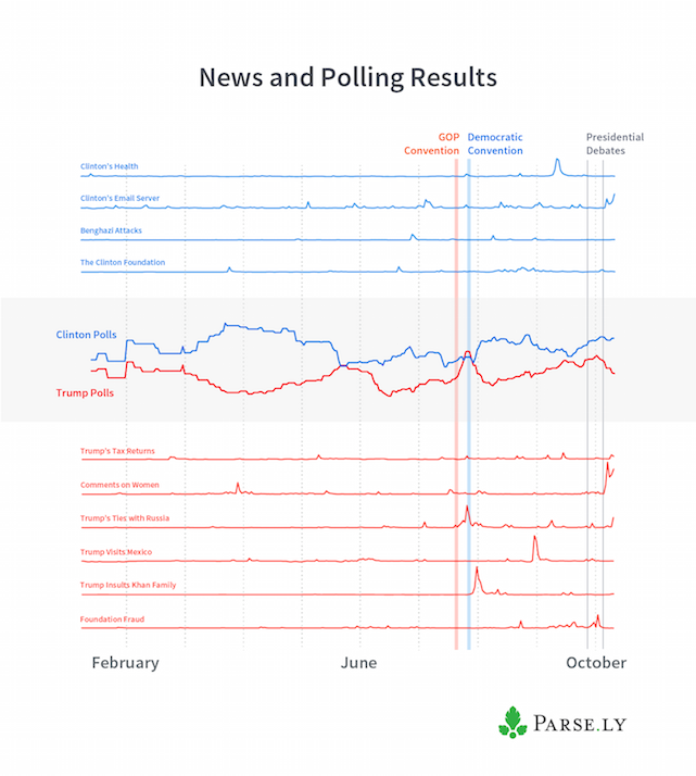
Last month, Parse.ly tracked mentions of Hillary Clinton and Donald Trump across our network of digital publishers. We compared the popularity of each candidate with RealClearPolitics polling averages. After providing the raw data to various news outlets for consideration, we were surprised to see that the resulting media coverage was conflicted.
Using the same data from Parse.ly, Talking New Media reported that the presidential candidates did their best when not leading the news, while Quartz reported no correlation between media coverage and slight fluctuations in voting decisions. Below is the chart we provided to both media outlets.

What do you think the data is saying?
Danger: Depending on Analysts to Interpret Data
American Press Institute’s Jeff Sonderman has said, “Presenting data as a form of journalism requires that we subject the data to a journalistic process.” The Associated Press would agree; it is planning to incorporate data standards into its 2017 AP Stylebook. These standards will include ethical issues, not just language and style.
This sends a clear message to the journalism community that both analytical and creative types are equally responsible for presenting clean, accurate, and well-researched data. In fact, although journalists are not typically data experts, they are becoming increasingly responsible for the accuracy (and the perceived accuracy) of the data they are including in their stories.
Chris Taylor, global platform director at Maxus Global, a media agency, recently opened up about the importance of data in storytelling:
“Storytelling is the act of communication through the use of narrative elements with the purpose of educating, entertaining or influencing others. When it comes to visualising data the same key concepts need to be adopted. A good data visualisation should guide the audience to the key information they need to understand what is going on, keeping them engaged throughout the process and helping them to make educated decisions […] Applying some of the rules of storytelling to data presentation can make a huge difference to the way it is received.”
Too often, telling stories with data is left to analysts who have not been formally trained to communicate key messages to a wider audience, minimizing the impact of the resulting data. That’s why it is so important to empower journalists to translate data into a more consumable narrative.
Just ask New York City officials, who are currently experimenting with making the subway map even easier for riders to understand. The data hasn’t changed, but different designers, users, and context have changed the way the data should be presented.
The writers and the “creatives” among us will be the ones who make sure data remains relevant in a changing world.
Other Interesting Reads
- “Big data can’t bring objectivity to a subjective world” (TechCrunch)
- “What The Failure of Election Predictions Could Mean for Media Trust and Data Journalism” (MediaShift)
- “Reimagining New York City’s Maps” (WNYC.org)