Beta feature: Benchmark authors, sections, and tags
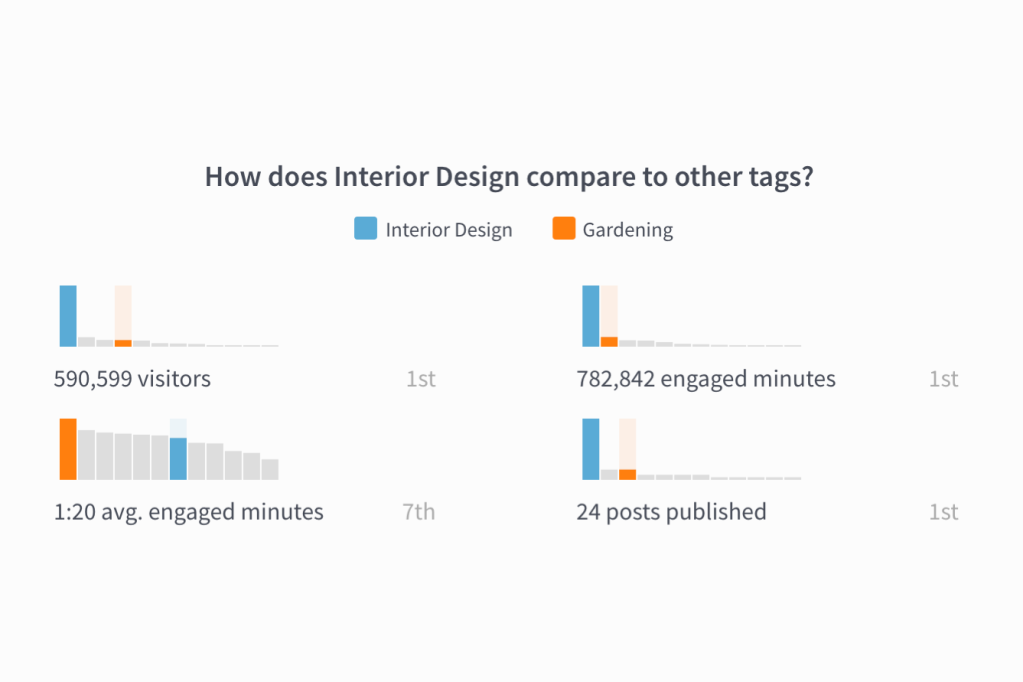
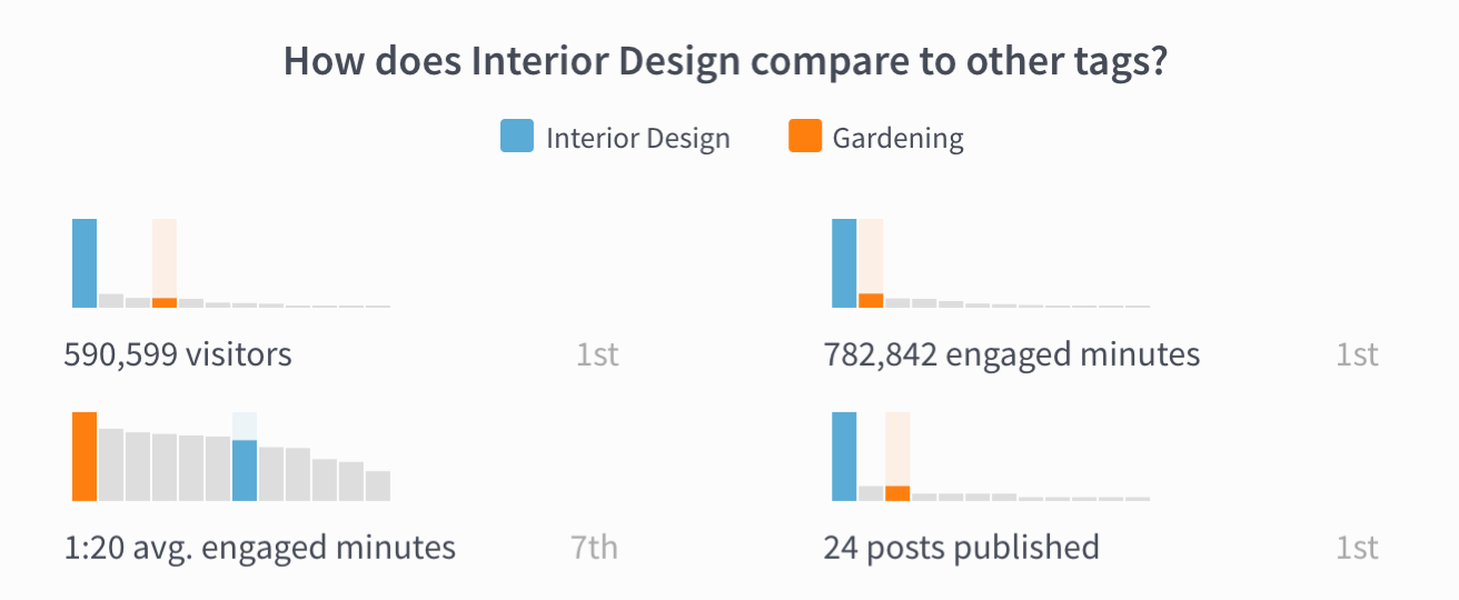
“What types of content aren’t worth the effort? Should we stop doing them?”
“Which author is better suited for this new role we’re creating?”
“Hm, the Business section gets significantly lower search traffic than other sections. Maybe we should optimize headlines there for better SEO?”
We want to help you better answer content-strategy-impacting questions like these. That’s why we’re introducing Benchmarks, a new way to compare performance. Benchmarks is a beta feature and may change as we respond to your feedback.
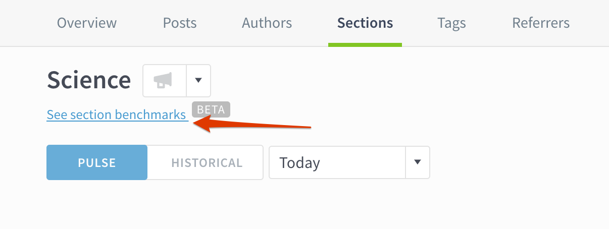
You can navigate to Benchmarks from any author, section, or tag details page:
This blog post will cover some of the main use cases to get you started. Check out our release notes to see everything that’s new.
What are the growth opportunities for me or my team?
How is this content category doing?
What’s working? What should we stop doing?
Benchmarks FAQ
What are the growth opportunities for me or my team?
When the Las Vegas Review-Journal began using author Benchmarks, they were immediately able to spot growth opportunities.
“Our Executive Editor and Managing Editor have already used the new Benchmarks tools to compare user engagement across teams, which has helped us identify content areas with opportunities for growth,” said VP of Digital Belinda Englman.
To see how you or your team is doing, head on over to an author details page and click “See author benchmarks.”
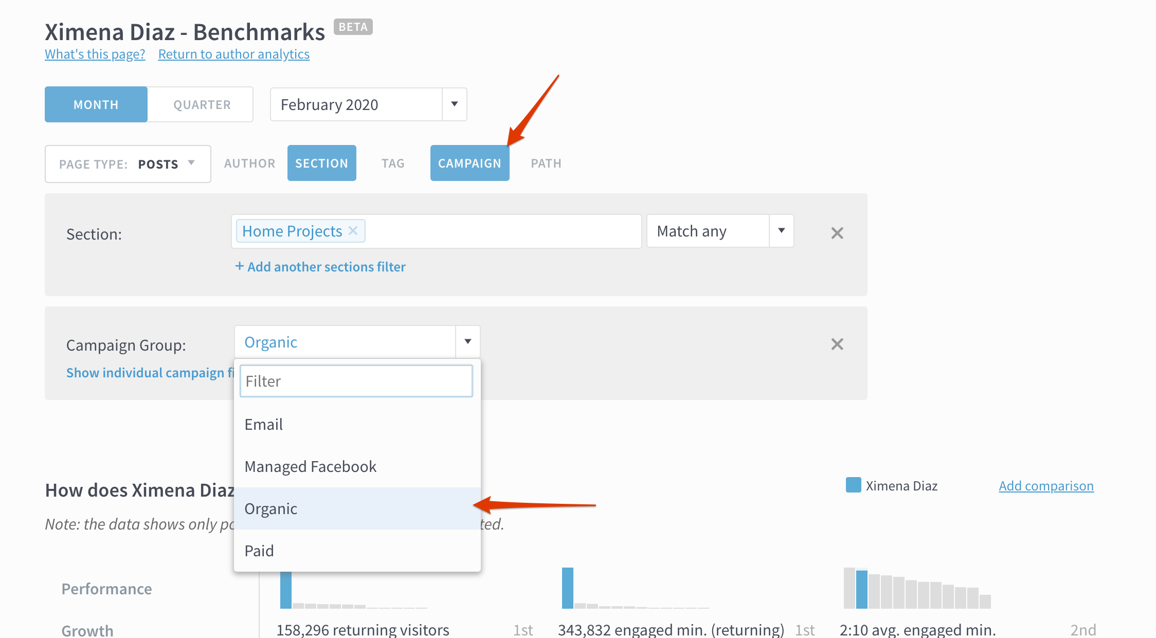
Filter authors by topic, campaign, and more
Want to compare only authors with overlapping coverage areas and audience expectations? Different topics (e.g. investing, sports, arts) will all have different engagement expectations across different platforms. Use the section and tag filters to narrow down to relevant results.
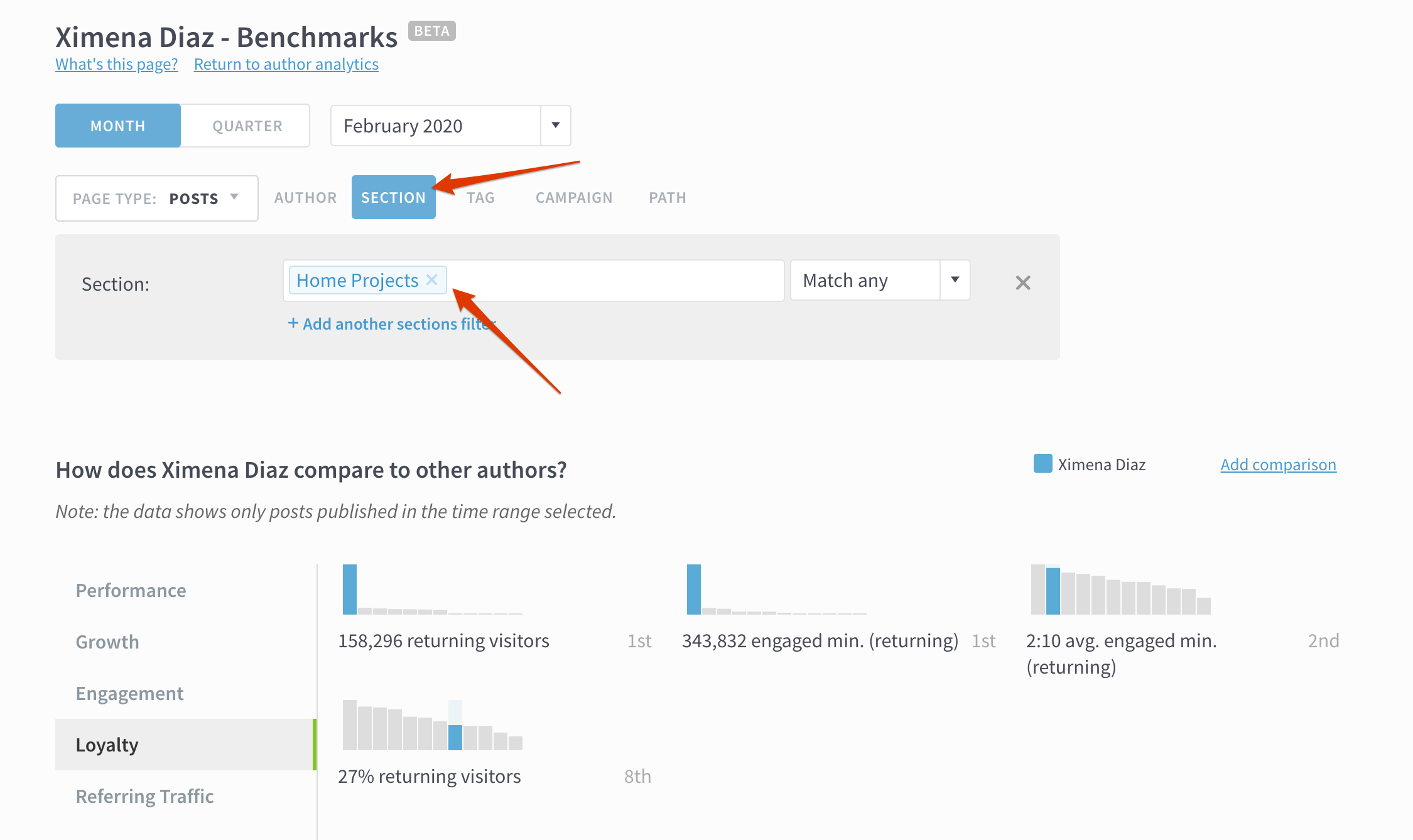
To see how marketing and distribution efforts impact metrics, filter by campaign. This allows you to see the numbers through an “email-only” or “organic-traffic-only” lens.
Benchmark multiple authors
Click “Add comparison” to compare this author to other authors (you can compare up to seven authors all together). Each selected author will show up on the charts below in a different color, making it easier to understand what elements influence their audience engagement, identify strengths across the team, and take action on the biggest opportunities.

Find strengths and weaknesses
What’s your priority? Growth? Loyalty? Better SEO? Click the the tabs on the left side to focus on the metrics that matter to you.

Say you’re comparing two authors, Karin and Xavier, who both write about interior design. Clicking on “Referring Traffic” may reveal that Karin is getting significantly more search referrals than Xavier. That’s a cue to check how Karin writes her headlines or subheads. Maybe there’s something you can learn from Karin’s process to help Xavier optimize his SEO.
How is this content category doing?
With Parse.ly, you can slice your content data in tons of ways by categorizing metadata. We’ve seen our users create section and tag taxonomies based on topic or section (business, investing, food), content type (video, roundup post, podcast), goal (Instagram referrals, SEO play), and more. You can compare these categories of content on a section or tag Benchmarks page.
Section and tag benchmarks work like author benchmarks. Select other sections or tags to compare to, filter down results, and evaluate performance based on a range of metrics.

What’s working? What should we stop doing?
Writing blog posts and articles, producing videos and podcasts—it all takes time and hard work. When a type of content or topic is really resonating with your audience, you might want to do more of it. And it’s just as important to find patterns in what’s not working, so you can stop publishing content that isn’t worth the effort.
Englman shared that Benchmarks have helped Las Vegas Review-Journal do just that: “At all levels of the newsroom, our staff have used the Benchmarks tools to improve our efficiency within certain beats. The tools allow us to clearly see which articles aren’t meeting our minimum benchmarks for visitors or page views, allowing us to divert our resources away from that type of content and spend those efforts on stories we know will better resonate with our users.”
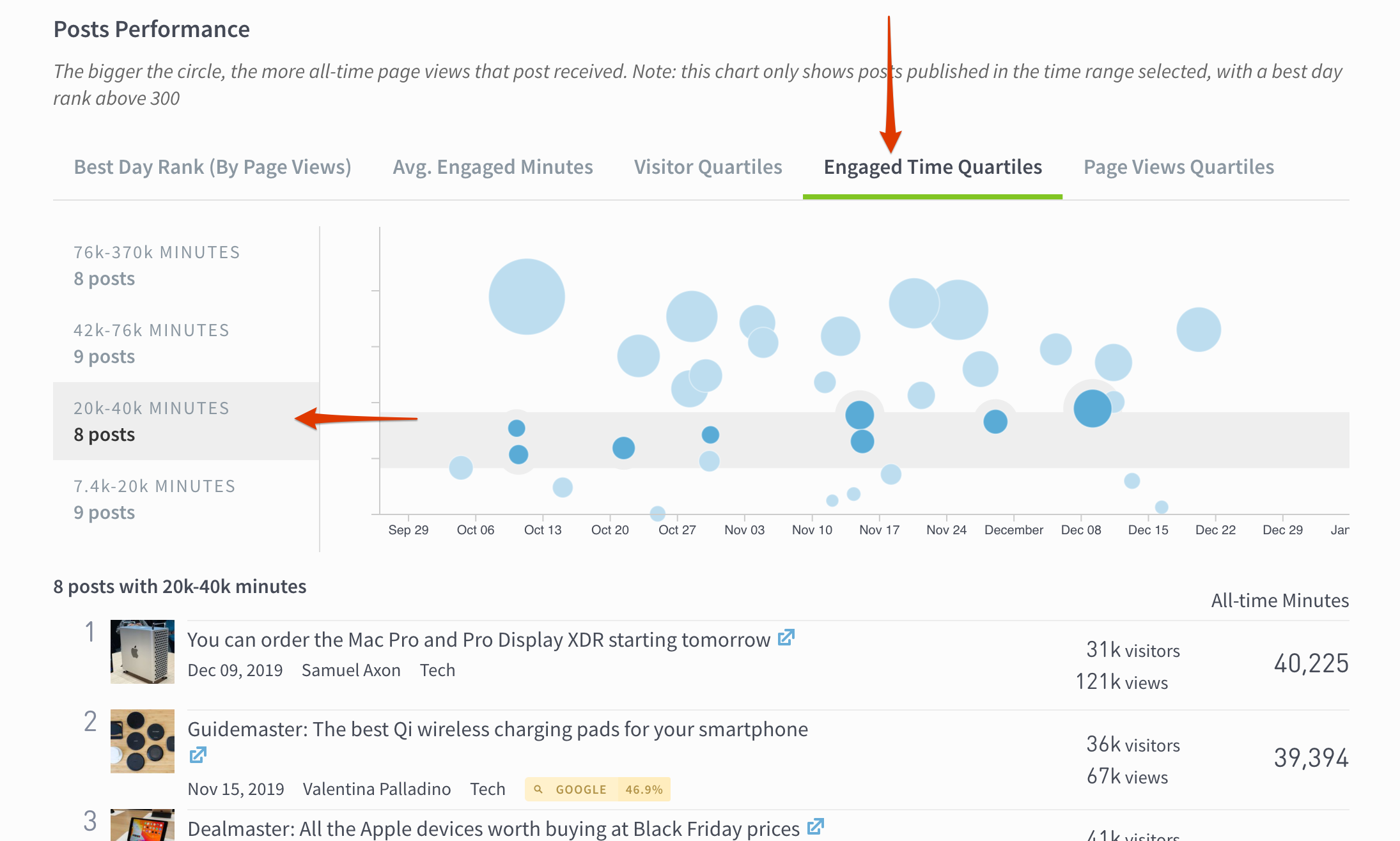
Try it yourself! Go to the Benchmarks page and scroll down to Posts Performance. The bubble chart buckets posts based on performance, which you can explore by clicking on the metrics tab on the left. Try clicking Engaged Time Quartiles and then select the lowest range to see a list of less successful posts.
Benchmarks FAQ
- What does best day rank mean? This is the highest position a post achieved based on page views. If you’ve applied no filters, the rank shown takes into account all posts across the site. The ranking may change based on the filters you apply. For instance, a post with a best day rank of #3 across the whole site may have a best day rank of #1 in the business section.
- What do bubble sizes mean? Bigger bubbles indicate more all-time page views, and smaller bubbles indicate fewer all-time pages.
- What is the cutoff for posts shown on this page? Posts will appear on this page if they were published during the time range selected (e.g. January 2020, Q4 2019) with a best day rank of 300 or above. This means that evergreen posts published outside the time range selected will not show up.
Tell us what you think
Benchmarks is a beta feature, and we expect it to change as we collect feedback from you. Let us know what you think by scrolling to the bottom of the page, clicking the thumbs up or thumbs down button, and leaving a comment.
