Whatever It Takes
How the Parse.ly team didn’t let implementation obstacles get in the way of delivering elegant, beautiful, and timely data digests to our customers via e-mail.
I frequently say that Parse.ly is lucky to have very smart and savvy individuals as customers. We work with editors, writers, and analysts at top media companies.
Let’s reflect on journalists for a moment. Their primary job is to collect voluminous and disparate raw data from a variety of sources. They then exercise analytical skills and editorial judgment to render that data into insights for readers and viewers. They need to do this quickly, as relevance and freshness are closely connected.
As a company whose flagship product provides web analytics to online publishers, this description of a journalist’s job sounds very familiar. In our case, our “audience” is the journalist, as well as the editors and analysts who support their work. This puts an enormous burden on us, but in a good way.
Our customers can tell the difference between real insights and noisy raw data. If we are providing noise with little signal, our customers will call us out on it. It means that every feature we release needs to be held to a high standard.
We also recognize that editors and writers are under enough pressure as it is. The last thing we want to do is waste their time when our software could do the work for them.
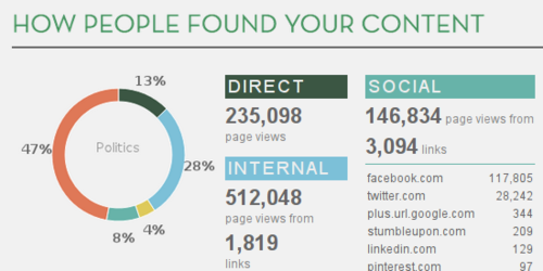
It is with this understanding that we embarked on a mighty project over the last couple of months. We built a powerful visual summarization of site traffic and publication trends called the Parse.ly Weekly Digest.
The goals:
- summarize millions of traffic and content signals into a weekly email that is personalized to each author or editor’s content
- provide context by benchmarking performance against the average of the past four weeks
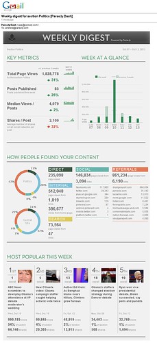
- deliver all the information in a personalized, rich e-mail, so that it can be viewed on the go (from mobile devices) or easily forwarded to other colleagues
This was a tall order.
It required weeks of rapid prototyping with existing customers providing us direct feedback on the metrics that mattered to them. And it involved several design drafts: from wireframe, to mockup, to data visualization prototype, to completed implementation.
It also required a Herculean engineering effort: to acquire and aggregate the right data; to implement the beautiful data visualizations; and to make those visuals work in the restricted technology platform of e-mail.
The original wireframe for the weekly digest was developed by Mike Sukmanowsky, Parse.ly’s Product Lead. Mike came to Parse.ly from the Globe & Mail, Canada’s premier daily newspaper and a top online news destination. There, he was Product Manager of Analytics. He developed the wireframe from his experience working with writers and editors at the Globe, and via interviews with Parse.ly customers over the course of several weeks.
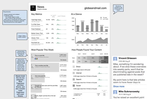
The wireframe was developed further through discussion on the Parse.ly team. A surgical team of three talented Parse.ly developers tackled the wireframe head-on: Kemper Smith, our visual designer; Toms Baugis, our UI/UX lead; and Vincent Driessen, a full-stack engineer.
Vincent started by prototyping some data analyses atop existing customers’ data. He had just finished an internal project where we analyzed customer post data to detect “Peaks” and “Troughs” — exercising our new real-time data store, which we call “Pulse”. This project gave him an opportunity to exercise our historical data store, which we call “PTrack”.
The result was a code prototype within Parse.ly that did some weekly aggregation of customer data based on the wireframe.
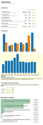
It was at this stage that we could prioritize pie-in-the-sky ideas against the capabilities and limitations of our existing data stores, while also establishing whether the chosen metrics “looked right” given the brutal reality of production data.
We also realized that the wireframe packed too much information across horizontal space, and that this would be too dense for e-mail (and even for the web). So, we sought to simplify the presentation from the wireframe a bit at this prototyping stage, going for more of a vertical-oriented layout.
Vincent’s work was then handed off to Kemper. Since Kemper knew exactly what metrics we could support and had real data to support a design, he could approach the problem directly. He sought to make an elegant and compact presentation, as well as a visual design that matched Parse.ly’s overall brand. The result was a stunning mockup of the Weekly Digest that was instantly loved by the team.
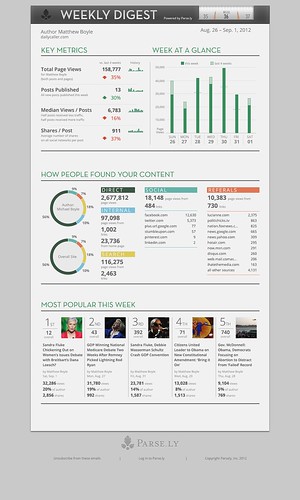
We now had enough material to get some early feedback from customers. We began circulating the mockup to customers who had provided feedback in the earlier stage, only weeks before. Through their feedback, we were able to make some small adjustments. More importantly, we received resounding confirmation that we were on the right track with the Weekly Digest.
Yet, we still had a problem.
We had a visually stunning mockup based on data that we knew we could aggregate easily. But there was still a gap between Vincent’s experiment and the mockup developed by Kemper. Could we cross this chasm? The engineering team was healthily skeptical.
Our UI/UX lead, Toms, suggested we just charge ahead with implementing Kemper’s vision using our workhorse data visualization library, d3. Toms was confident that we could reproduce the visualizations that Kemper had designed using d3. Kemper agreed, and even started work on doing so. Kemper is that rare breed — not only a visual designer, but also a JavaScript programmer.
As this collaboration between Toms and Kemper went on, they knew there was a roadblock over the horizon: e-mail. d3 is a framework which only runs within a web browser, and for the visualizations we wanted to create, we’d need to use a powerful browser graphics subsystem called SVG. But e-mail does not support SVG.
Some background on the challenge of rich e-mail. Up until a few years ago, the best you could do in e-mail was plain text. But most e-mail clients over the last few years have adopted HTML e-mail, which allows use of a limited amount of HTML, CSS, and in-line images — though, no JavaScript or SVG. E-mails have to be very conservative in the markup they do use, since they tend to be viewed in, shall we say, “hostile” environments. Consider that the same e-mail can be rendered in a slew of desktop clients (Apple Mail, Microsoft Outlook), web clients (GMail, Hotmail), as well as mobile environments (iPhone Mail, Android GMail, or Blackberry Mail). What’s worse, the e-mail in webmail clients renders differently in different browsers. This is even worse than the cross-browser problems that exist on the web.
How could we get from a rich, dynamically-generated visualization that only works in modern web browsers into this limited HTML e-mail environment?
I had an idea.
I had recently been testing browser automation technologies for doing better automated testing of Parse.ly. One of the technologies I came across during my work on this was PhantomJS. It is a full-fledged modern browser (based on WebKit, same engine that runs in Chrome and Safari) that you can run on a server and script it via JavaScript code.
I wondered: could we perhaps get PhantomJS to run our data visualization on the server, capture the rendered output, and then assemble an email with light HTML, CSS, and rendered images? By moving the complexity from the e-mail to server, we could guarantee they work in the cornucopia of fragmented environments that define HTML e-mail.
I discovered that PhantomJS’s browser not only supported SVG, but also that it already had an interface for capturing rendered output from the browser engine into a variety of image formats. This seemed promising.
We had a hopeful path forward: a possible way to turn Kemper’s beautiful design into a pixel-perfect rendition in HTML e-mail.
Vincent got to work on a new internal library called domshot. The idea behind domshot: allow our team to assemble rendered web views — using the Python web technologies we use and the d3 visualization library — and capture parts of the screen as images. He then refactored his code prototype to use domshot.
The next couple weeks of iterative development saw Vincent getting closer and closer to having domshot working perfectly with the experimental PhantomJS project and our live data. Meanwhile, Toms and Kemper got closer to getting a web view of the Weekly Digest to work fully across all our customers’ data using live d3 renderings on the web.
The Parse.ly team was firing on all cylinders.
Once domshot and the renderings were working well together, it was time to get everything into the email itself.
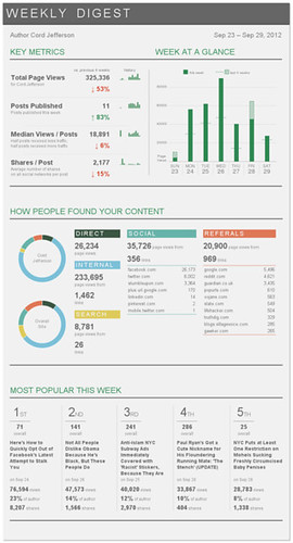
Toms crossed some t’s and dotted some i’s. He leveraged Amazon Cloudfront to host the dynamically-generated, personalized images for each e-mail, and linked those from the rendered HTML mail templates. He also whipped together a Parse.ly admin interface that let our team schedule mailings to individual authors and editors, specifying filters on things like section and author. Then, one day, I received this e-mail in my GMail inbox:
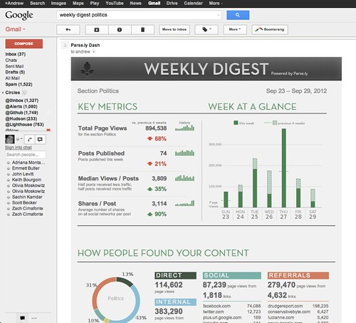
My jaw dropped. We had done it.
I once attended a one-day course by the renowned Information Visualization educator, Edward Tufte. Something Tufte said that day struck me:
In good information visualization, there are no rules, no guidelines, no templates, no standard technologies, no stylebooks. Instead, to convey the right information to your audience, your approach is both obvious and difficult. You must simply do whatever it takes.
In my work at Parse.ly over the last few years, I’ve developed and nurtured an enormous respect for the work done by our customers: editors, writers, analysts, journalists.
Day in, day out, they do whatever it takes to make real, sustainable journalism happen on the web.
The least we could do on the Parse.ly team is return the favor.
Written by Andrew Montalenti, CTO: @amontalenti
Follow us on Twitter: @Parsely